04 March 2012

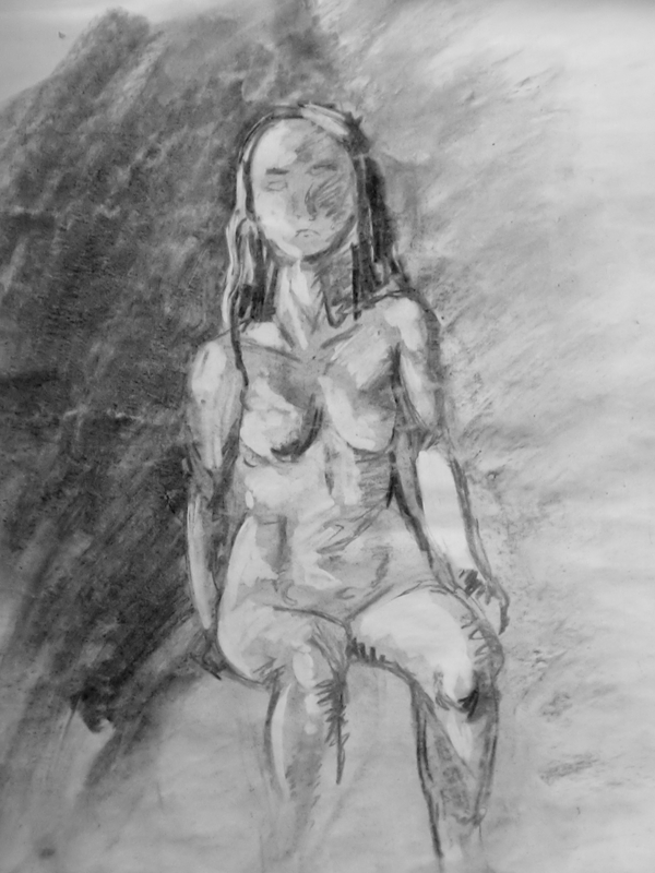
Figure Drawing - Light and Dark


On this module of Drawing II we worked on the human figure with dramatic lightning, learning how it shapes the body. 

Date: October 2010
Media:
Charcoal on 90 g/m2 paper


Animals and Metamorphosis


These drawings are from Drawing II. For some weeks the class went to the Natural History Museum to draw the animals. Then we had to incorporate those drawings with previous human figure drawings.


Date: November and December 2010
Media: Watercolor, colored pencil, pen and graphite on 90 g/m2 paper


Scientific Illustration


These drawings are from an introduction class to scientific illustration in Drawing I. We had to pick a natural element and draw some sketches (bottom) for about 30-40 minutes. Then we had to draw the final version (top) on A2 sized paper with pen only
for about 1h30.


Date: May 2011
Media: Graphite and pen on 90 g/m2 paper


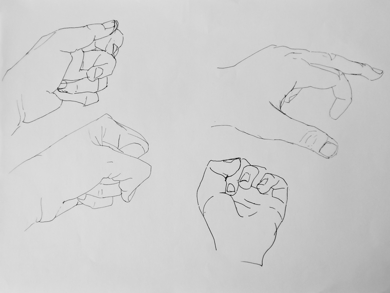
Outline Sketches


This module in Drawing I was about contour and inside contour.
The objective was practicing drawing accurately without erasing.
At first the drawings took a long time in order to resemble the object. They then started to take less time and it was only a step from contour drawing to sketching quickly with a pen and taking
in the key features.
The landscape took 30 minutes, the hands were about 2 minutes each (hand). The objects took about 15 minutes and the people took 5 minutes or less per drawing.
Click to view in more detail.

Date: February and March 2011
Media: Pen on 90 g/m2 paper


03 March 2012

Pictograms - Vehicles


On this project we had to make two sets of pictograms for a chosen theme. I decided to work about vehicles.
The top exercise was to translate good, neutral and bad. I used the tire because it’s easily associated with the vehicle. I then represented the tire in good shape, with a shine, a used tire with a mend and a flat tire to show its bad shape.
The bottom exercise is a scale of my own, representing past, present and future vehicle. For that I took a more humorous approach and appropriated myself of cars from animation series: The Flintstones, The Simpsons and the Jetsons.


Date: November 2011
Software: Adobe Illustrator CS4


Disclaimer: All trademarks are property of their owners and are used here for academic purposes only.

Word and Icon


This project was about taking a pair of words and present the words in a way that the word itself translates its concept.
The way in which we did it and what perspective we gave it was entirely free. I chose the duo Pop / Rock.
For Rock, I took advantage of the fact that the word has four letters and replicated AC/DC’s logo as it’s on the album “Back in Black”, one of the most sold albums on the world.
I also approached the distortion on rock music by taking a sans-serif font, Helvetica, and distorting it, in the style of sound waves.
For Pop I wanted to translate the happy and commercial sound as well as the theatrics and eye-catching colors.
One of the solutions was inspired on sound bars and could almost be looked at as a logo for a magazine or a website.
The other solution was more focused on theatrics, exuberance and the influence of pop music through the decades. I chose to humanize the letters with famous hair-do’s from the 60’s, 80’s and 00’s (The Supreme, Madonna and Lady Gaga, respectively) and added a flashy gradient to reinforce the message.


Date: November 2011
Software: Adobe Indesign CS4
                Adobe Illustrator CS4


Disclaimer: All trademarks are property of their owners and are used here for academic purposes only.


Pagination


The aim of the project was to familiarize ourselves with different types, become aware of composition, harmony, space, proportion, organization of the text on the page and learning ways to emphasize and translate what we wish given certain rules.
We were given three sentences; a quote, a quote with a reference and a Chinese proverb.
We were to paginate the sentences in as many ways as possible, ranging from the boldest to the most optimized solution.
There were four sets, each with its rules: using one font at one size; using one font and explore different sizes; using one font family and explore size, weight, and angle and lastly, using two different fonts from different families.
Here I present some of the solutions.


Date: October 2011 
Software: Adobe Indesign CS4


Kitchen Alphabet


The objective of this project was to create an alphabet with everyday objects that belonged to the same universe. I chose to make it of kitchen utensils.
A high-contrast vector version was also created.


Date: March 2011 
Software: Adobe Photoshop CS4
                Adobe Illustrator CS4
Camera: Casio EX-Z90


Font Legibility


On this project the objective was to explore the legibility of font.
We had to write our name and each letter was bound to a square and we could do anything except deform its original shape.
The aim was taking the legibility of our name to the limit, testing just how far that could be.


Date: October 2010
Software: Adobe Indesign CS4